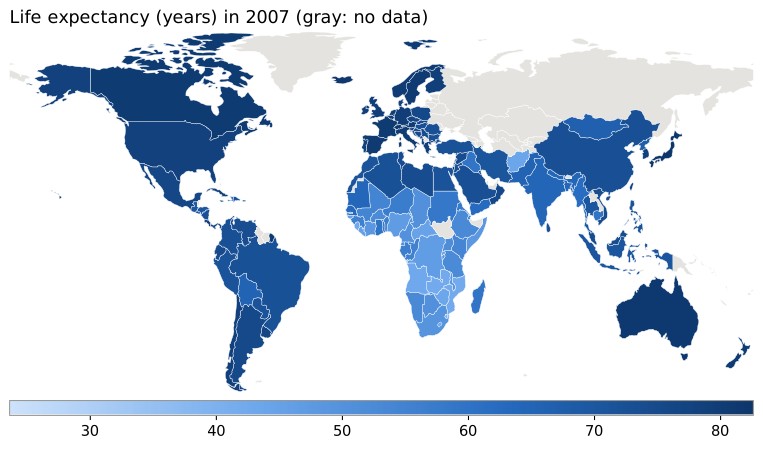
Gapminder in matplotlib

Every chart below is an SVG that a Flask server draws with matplotlib each time you change an input. Without JavaScript the forms still work: they submit and reload the image.
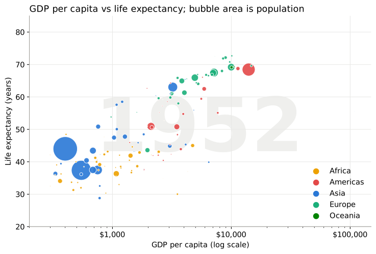
1. GDP per capita vs life expectancy

Bubble chart of GDP per capita against life expectancy by country

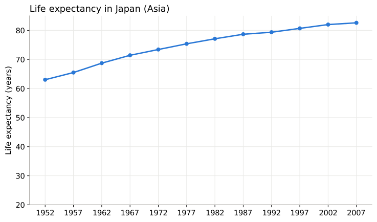
2. Life expectancy over time

Line chart of life expectancy over time

3. World map

World map colored by the chosen metric